Ata
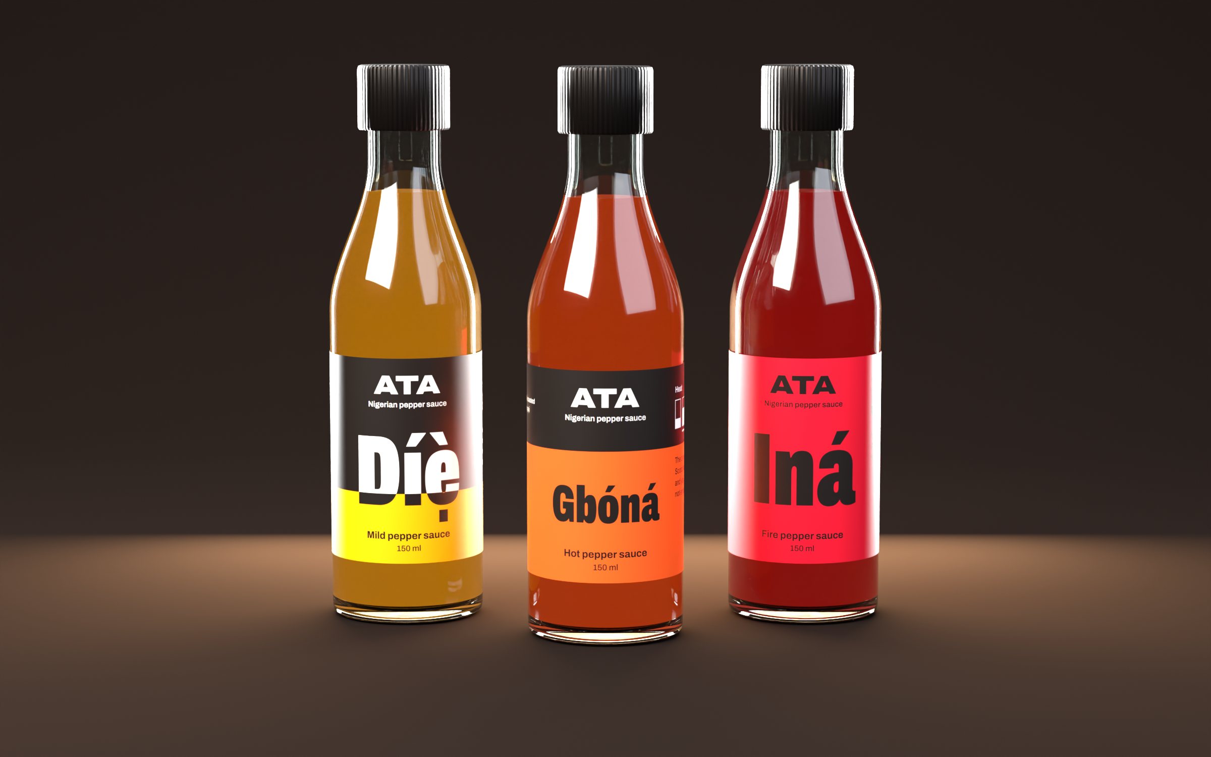
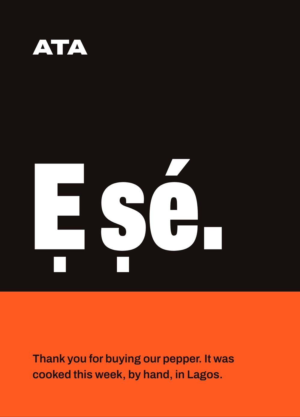
A West African pepper sauce in three heats. The label had one job: tell you how hot it is before you open it.
- Brand identity
- Label system
- Gift box
- Shipping carton
- Delivery bag and livery
- Carrier bag
- 3D renders
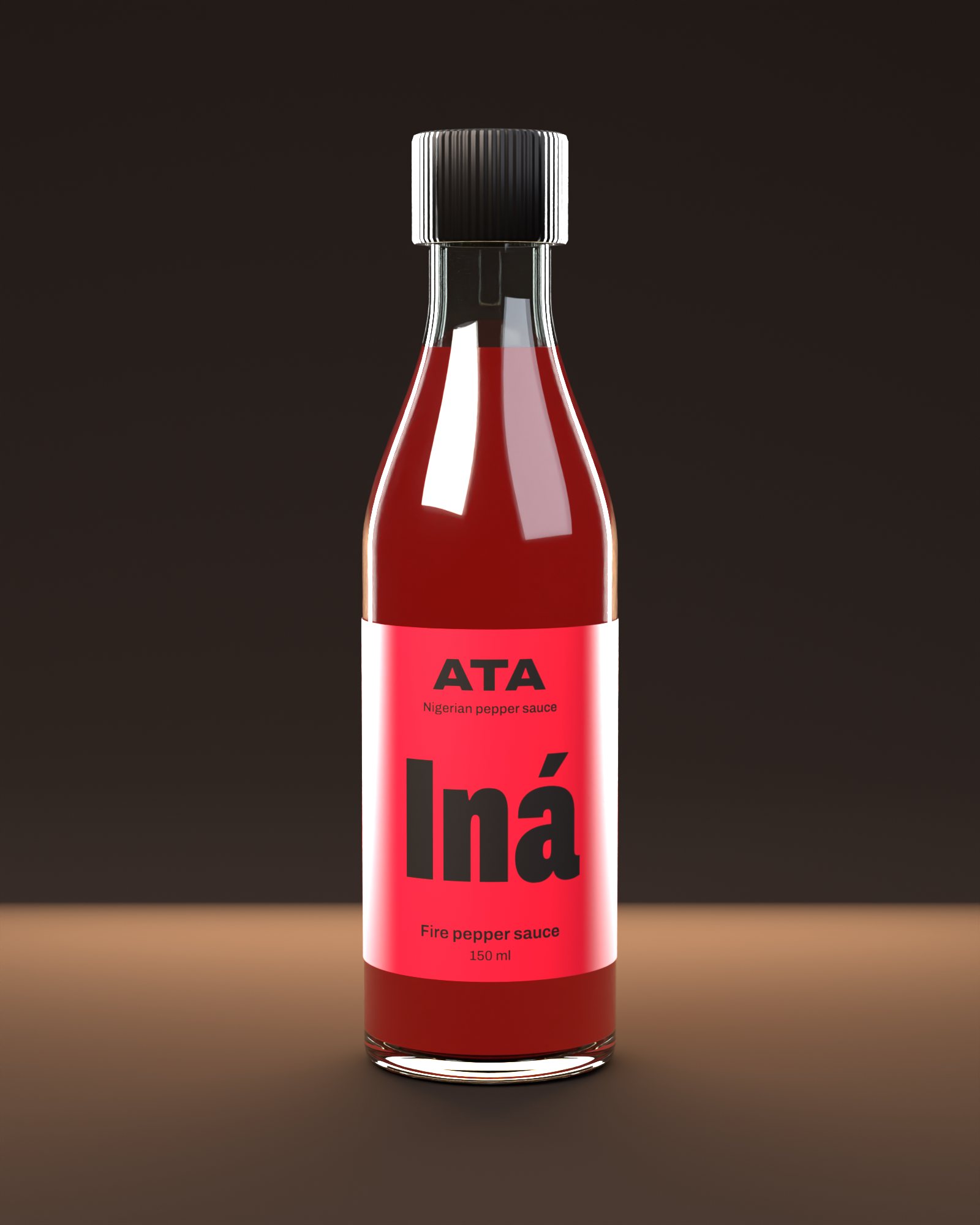
Pick it up.
Drag to turn the bottle. The label is the real print file, so what you see here is what the printer gets.
The idea
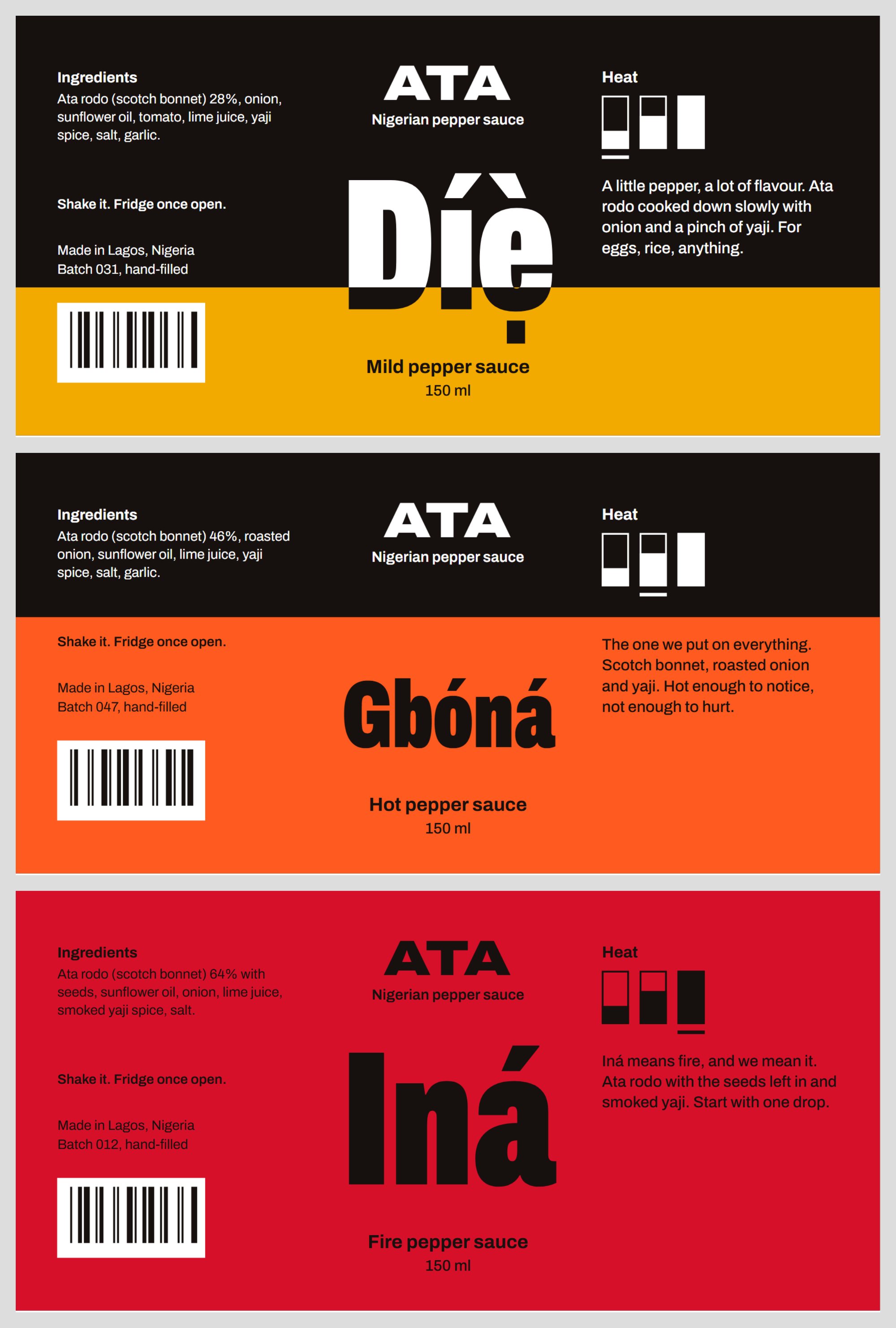
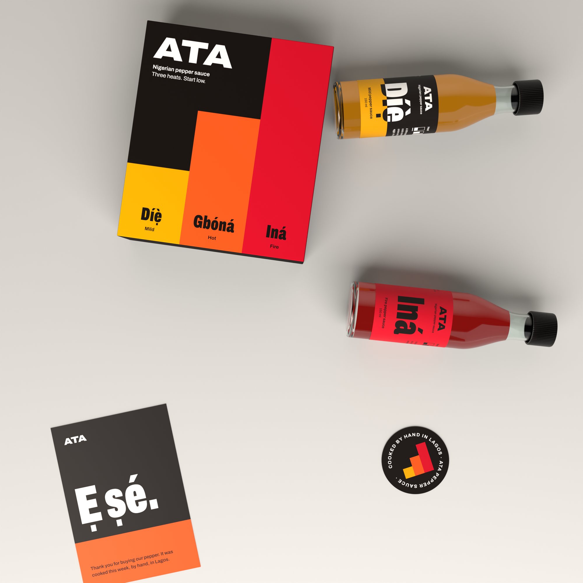
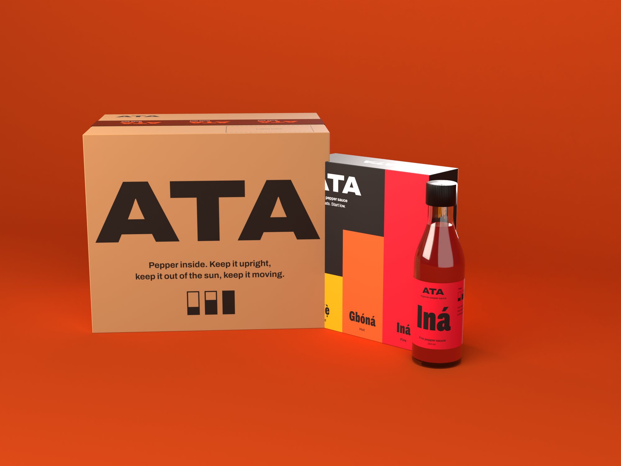
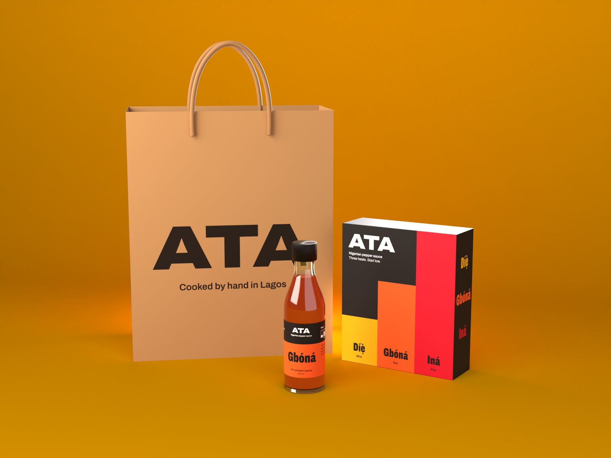
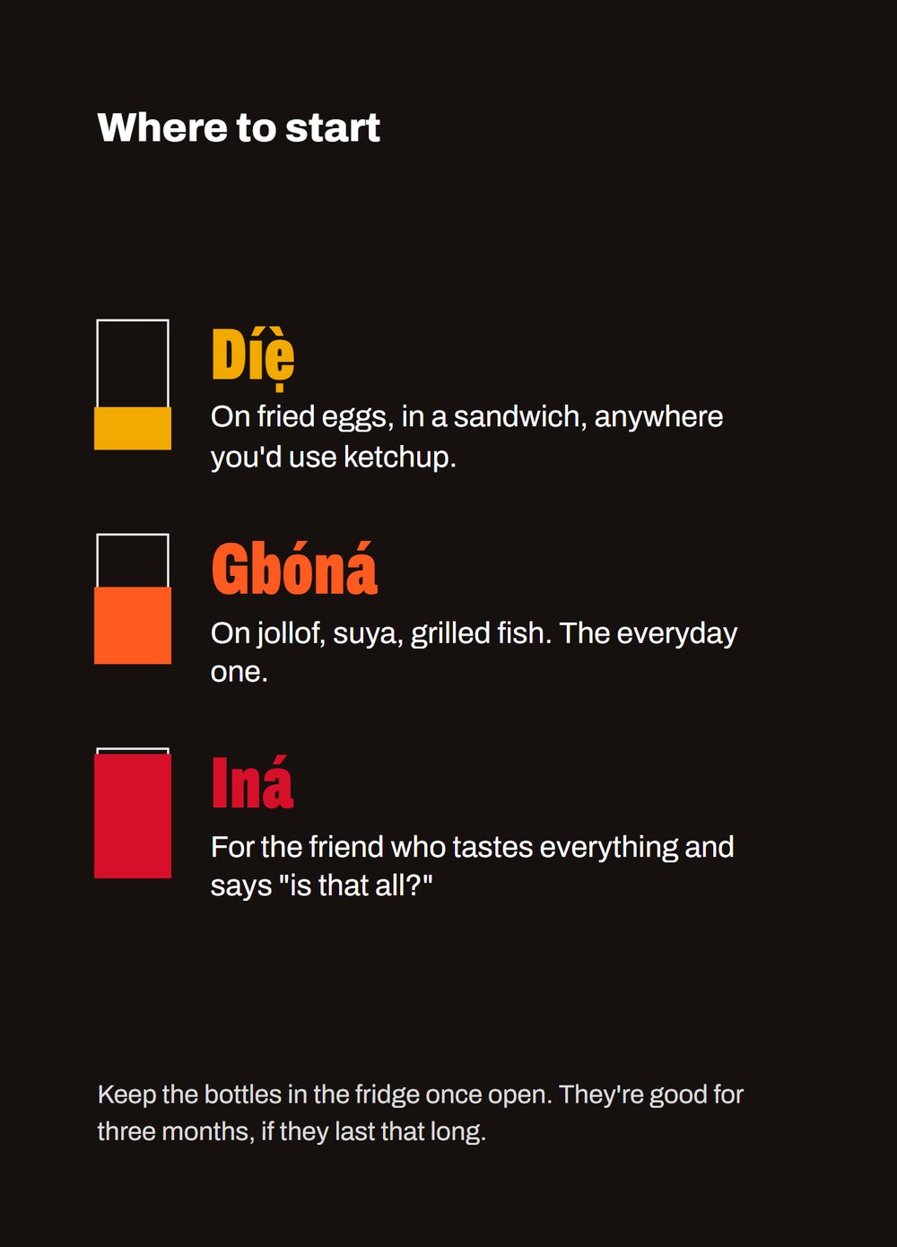
The colour rises with the heat. Mild fills a third of the label, hot fills two thirds, fire floods it. The names are Yoruba, Díẹ̀, Gbóná and Iná, with English underneath for shelves in London and Houston.
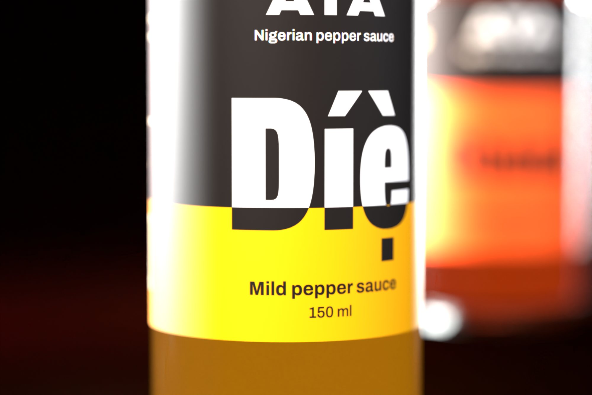
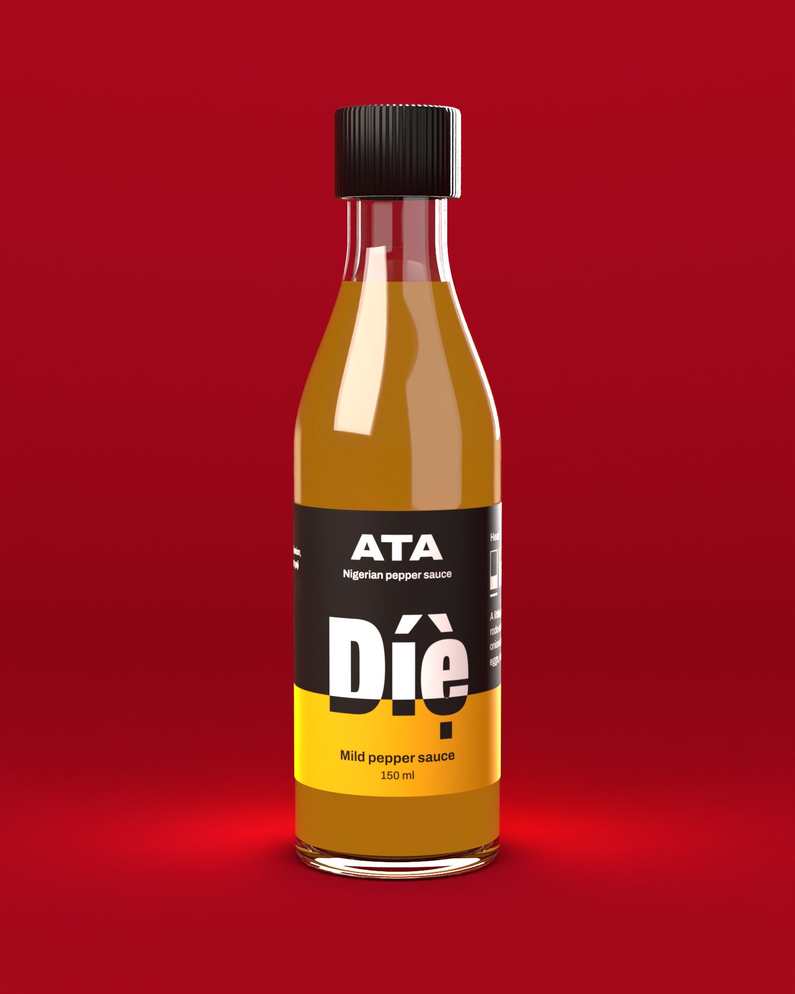
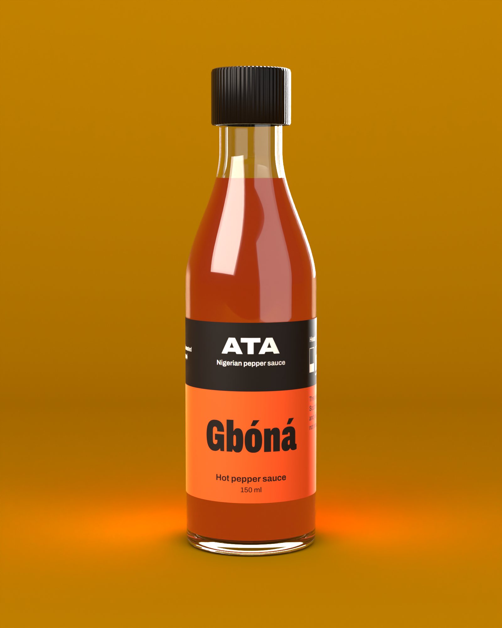
Caught in 3D
Our first front panel was 60 mm wide. On a 48 mm bottle that wraps out of sight, and the edges of the name disappear. We saw it in the render, cut the panel to 44 mm and centred everything, before a single label was printed.
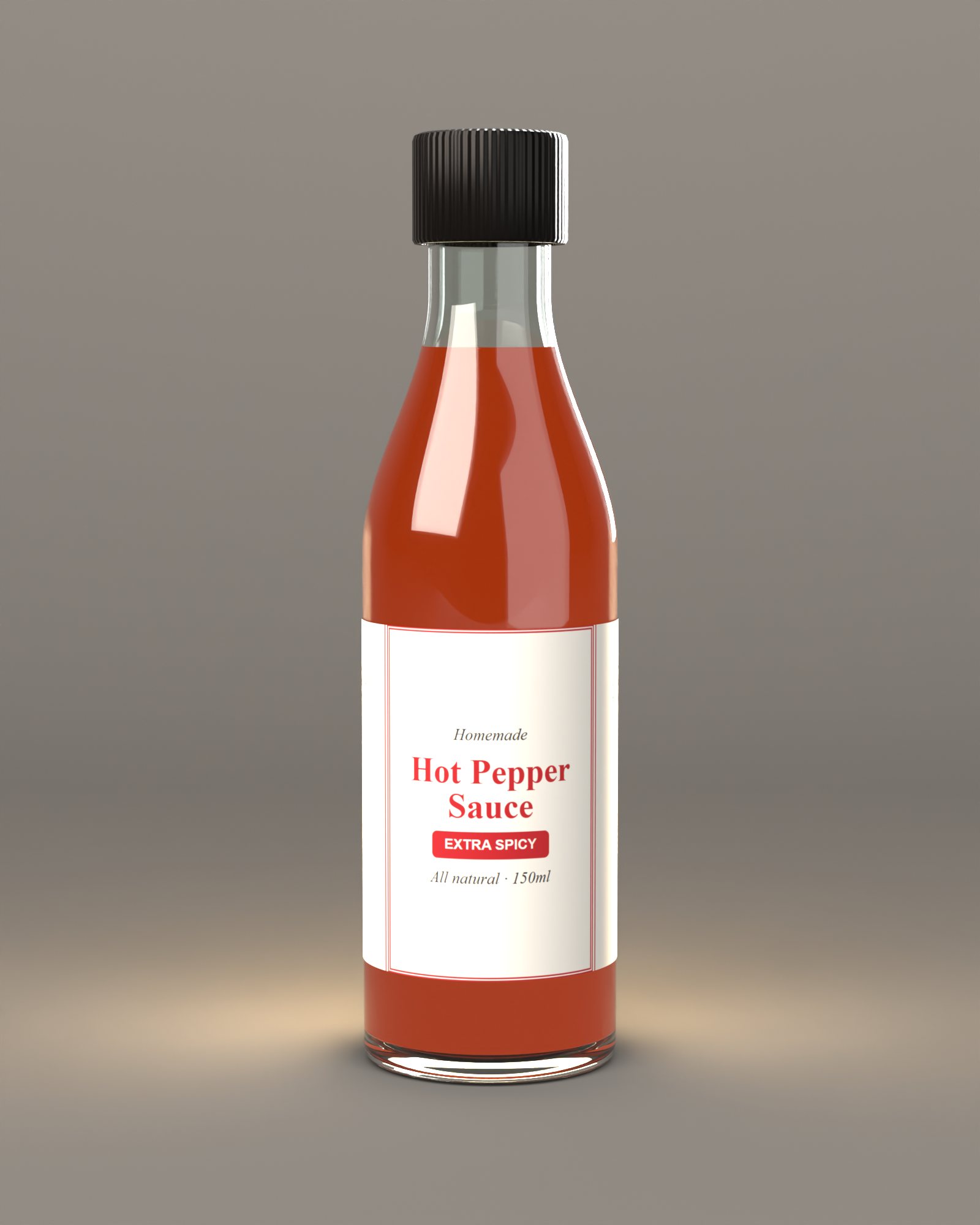
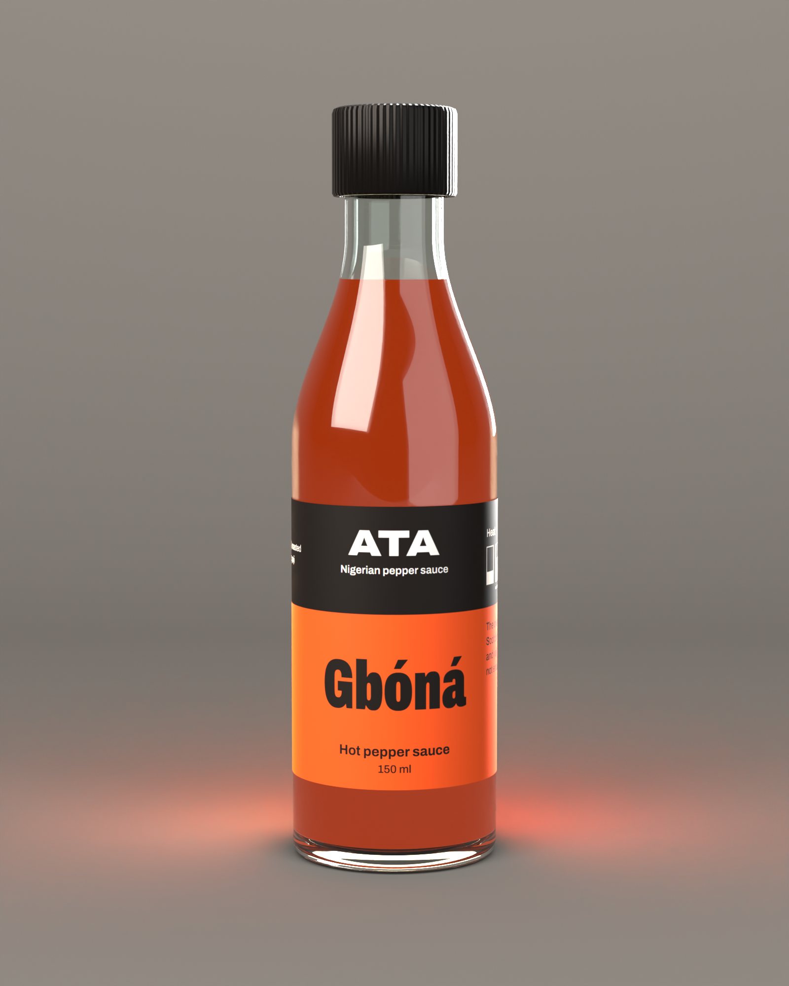
Same bottle, same light. Only the label changes. The "before" is a typical small-batch label we drew ourselves.
One box, three heats
The gift box puts the three levels side by side, so the box itself is the heat chart. Inside it's plain board, so the colour stays on the outside where it sells.
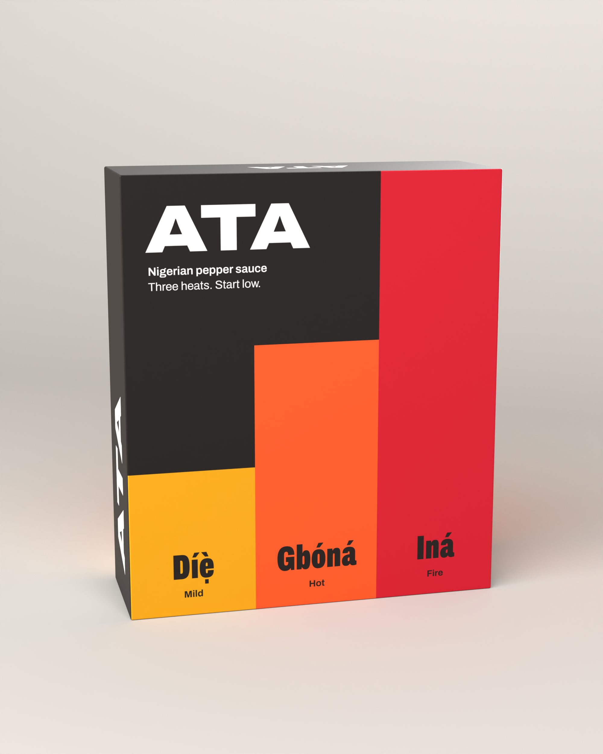
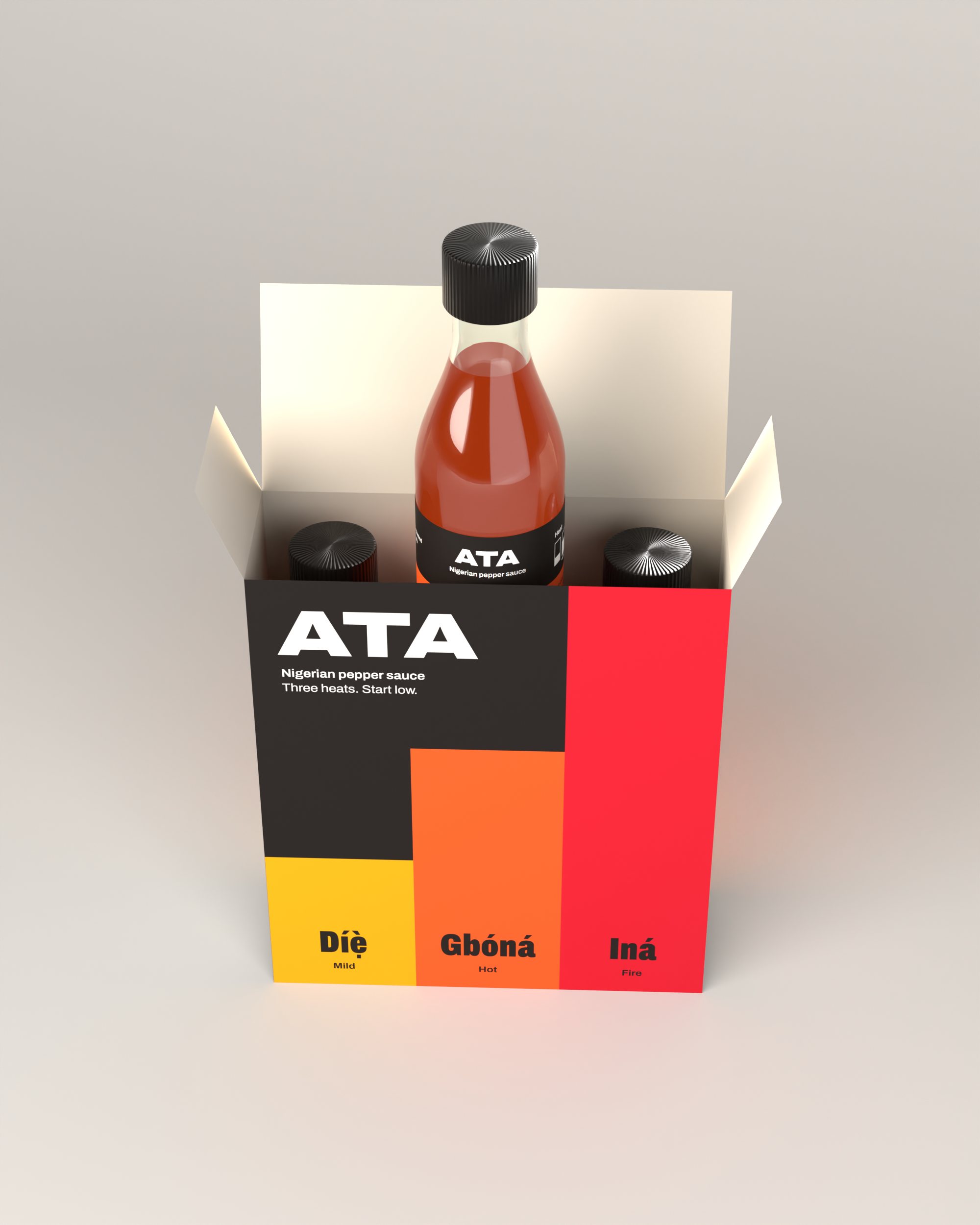
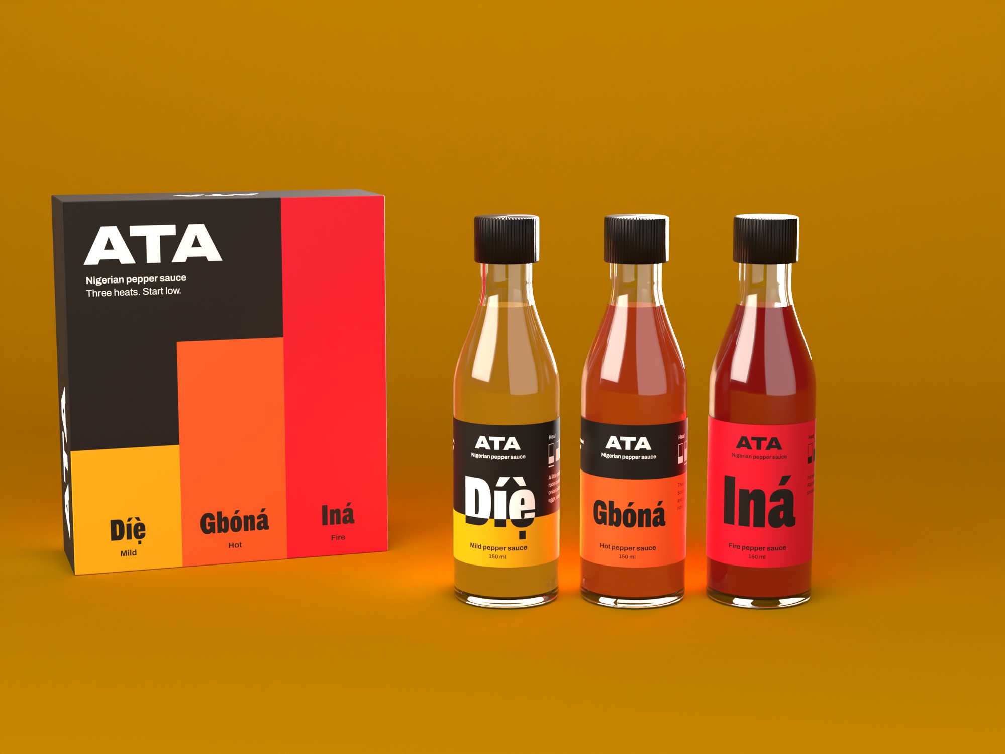
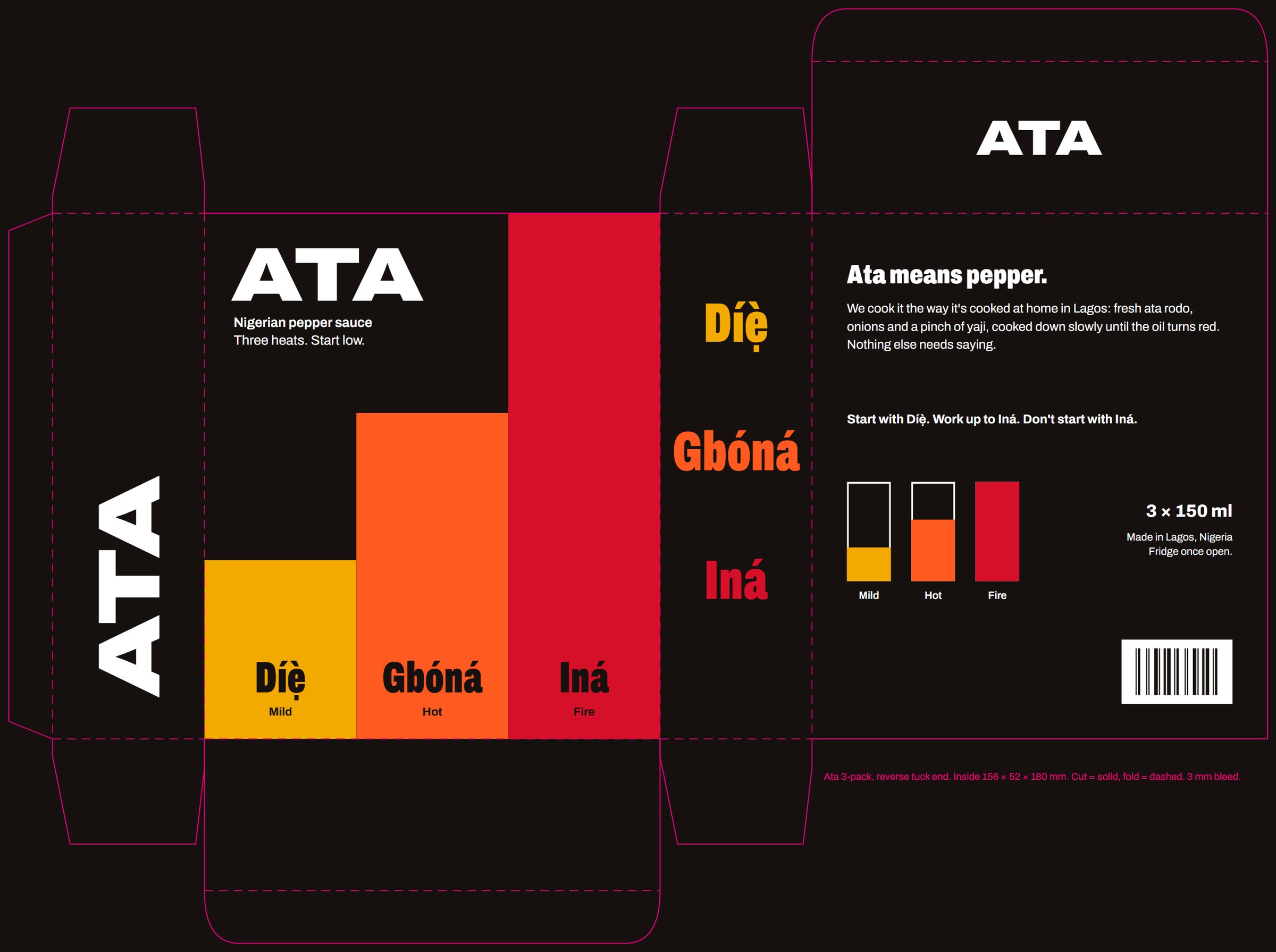
Reverse tuck end, 156 × 52 × 180 mm inside. Cut lines solid, folds dashed.
On the road
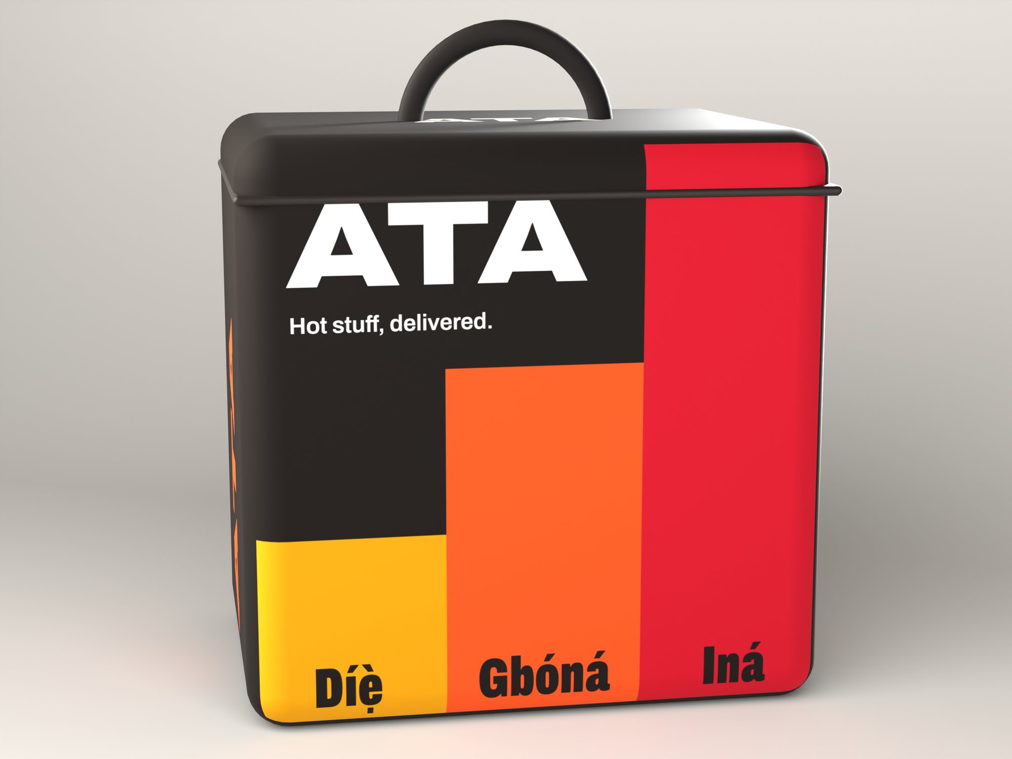
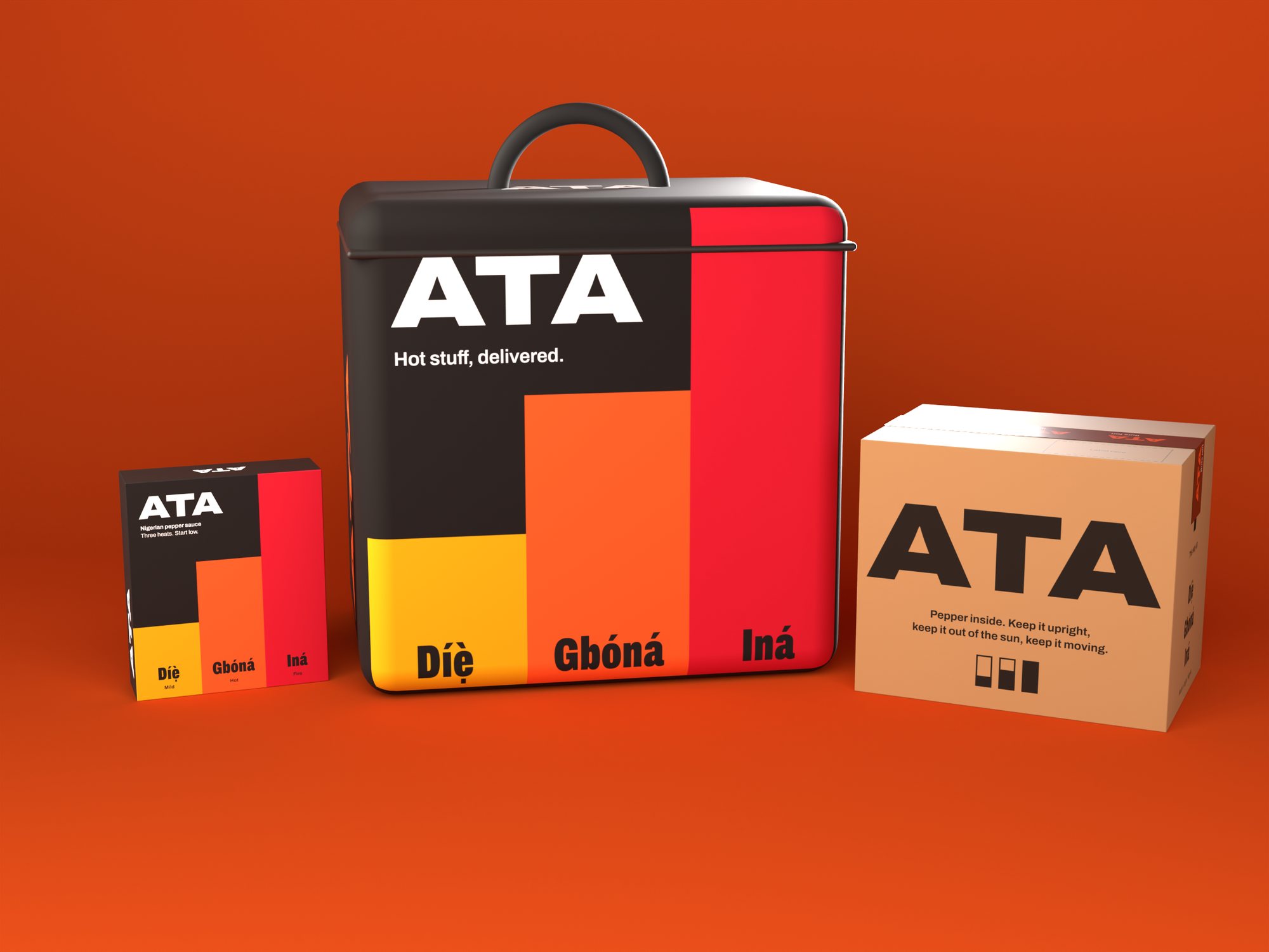
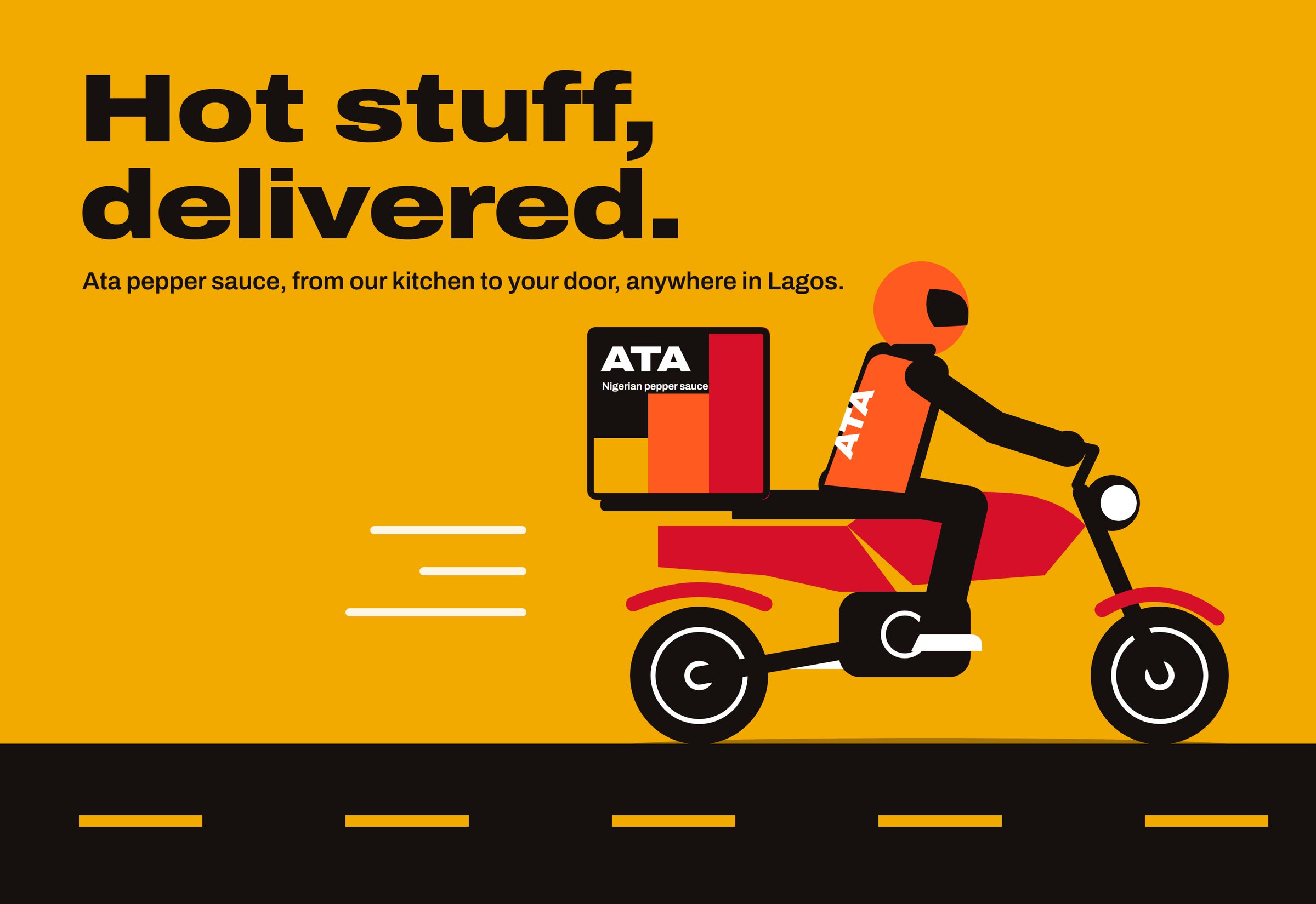
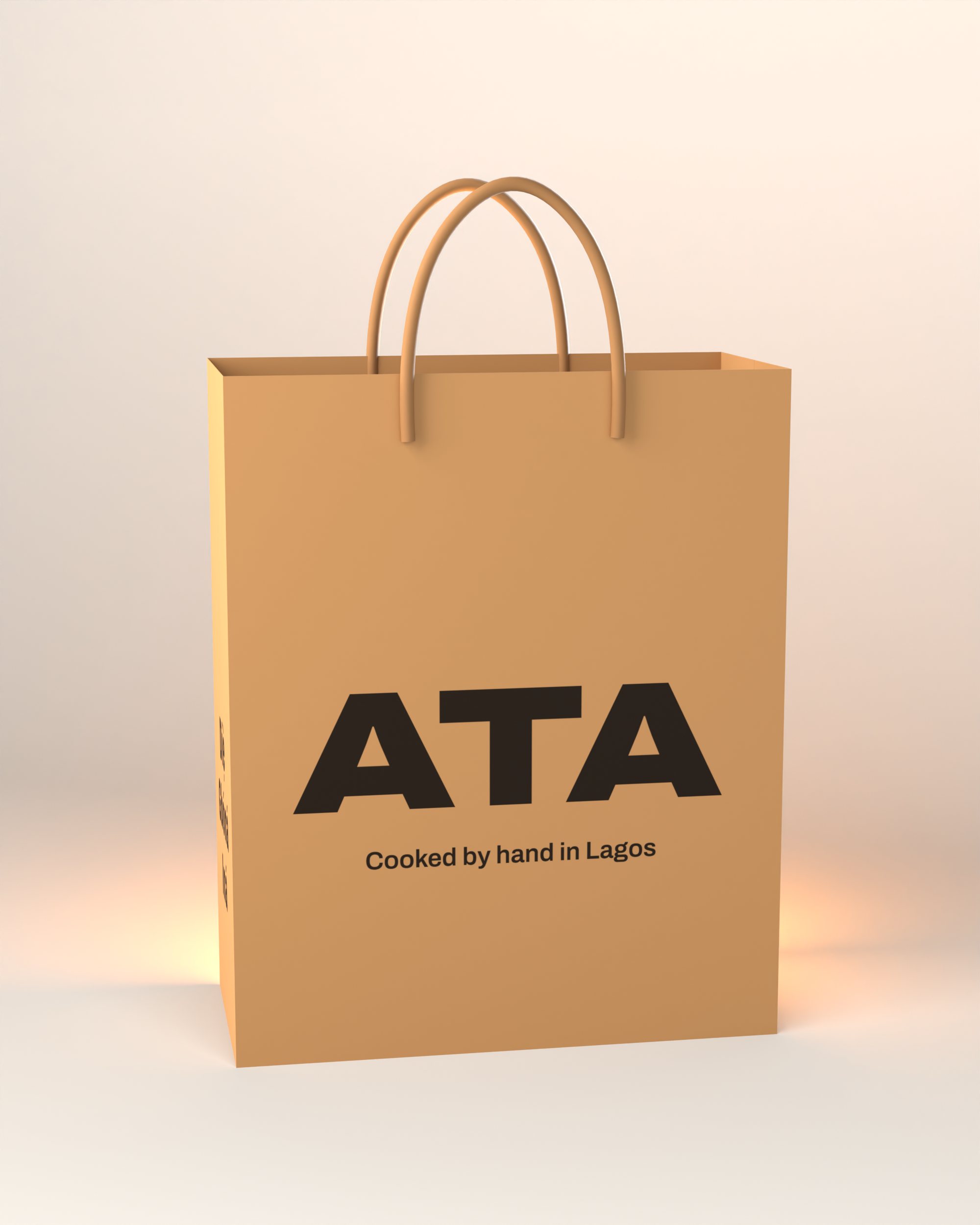
Orders leave in a kraft carton printed in one colour and sealed with Ata tape. Riders carry them in an insulated bag you can spot in traffic. Shop orders go home in a kraft carrier.

What it should do
Let someone pick the right heat in two seconds, from two metres away. Read as one range on a shelf, in a gift box and on the back of a bike. Give a small kitchen a brand big enough to grow into.
Dog treats built to win the click on Amazon.
See the work